LEI FOR LAHAINA
Event Program | Art Direction | Branding | Logo Design | Graphic Design | UX/UILei for Lahaina is a community-driven event created to raise funds for families affected by the devastating August 2023 Lahaina wildfire. Through lei-making, mele (song), and prayer, the event honors Hawaiian resilience and the spirit of aloha.
To capture its strength and hope, I developed the event’s logo, branding, and marketing materials, crafting a visual identity that feels both uplifting and rooted in Hawaiian culture. This ongoing project continues to support the movement to keep Hawaiian land in Hawaiian hands, preserving the culture and community that define Lahaina.

01 Tone of Voice and Brand Personality
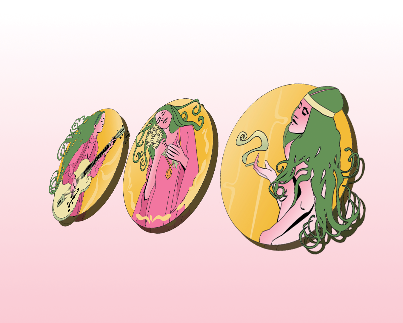
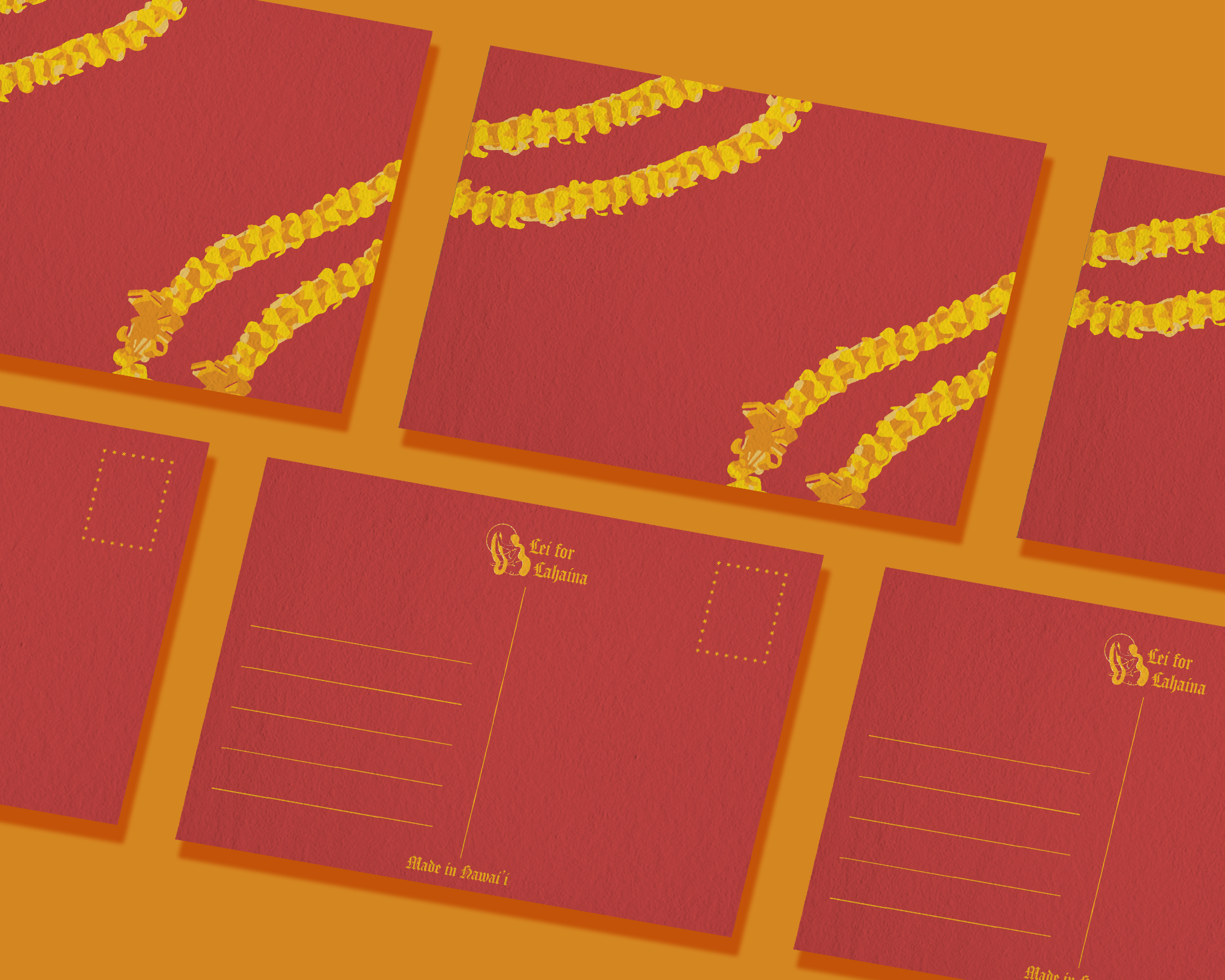
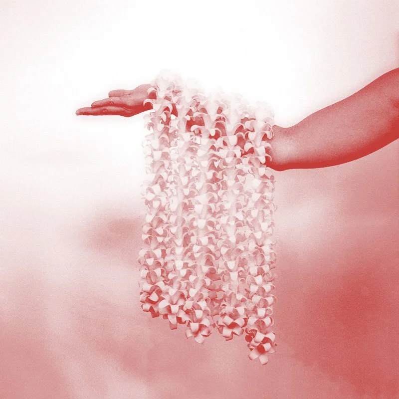
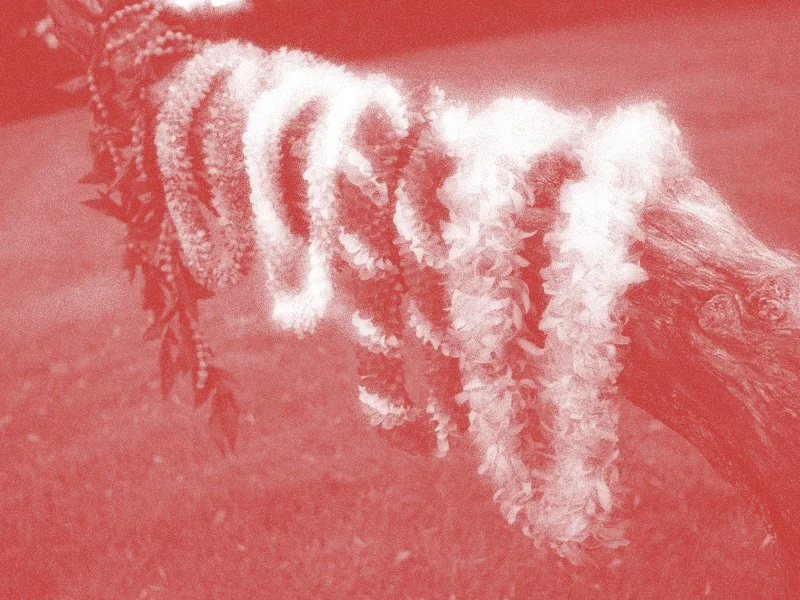
The Lei for Lahaina branding centers around the symbol of the lei– a representation of aloha, honor, and celebration, as well as a connection to the spiritual and natural world.
Just as a lei is created by many hands weaving flowers together, the rebuilding of Lahaina relies on many hands coming together in unity and care. This symbolism guided the visual identity, embodying both resilience and community healing.
In Hawaiian tradition, red and yellow were sacred colors of royalty and the gods–symbols of strength and resilience reflected in this event’s identity.
02 Logo Development
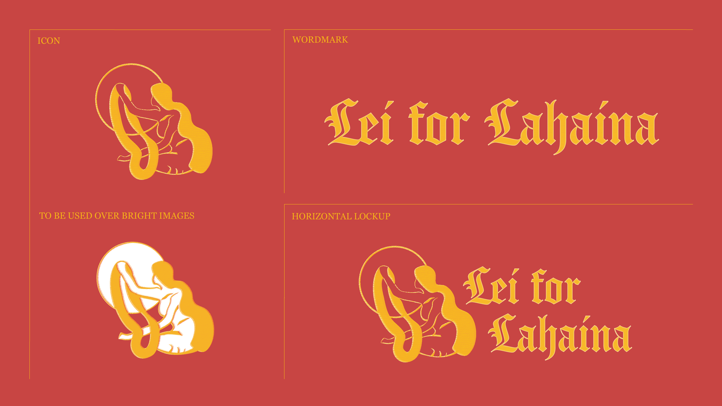

Lahaina translates to ‘merciless sun’ in English. With this logo, I wanted to reframe that intensity into a symbol of resilience and renewal. The sun represents strength and regrowth, while the woman offering a lei evokes the promise that life, even after hardship, will bloom again.
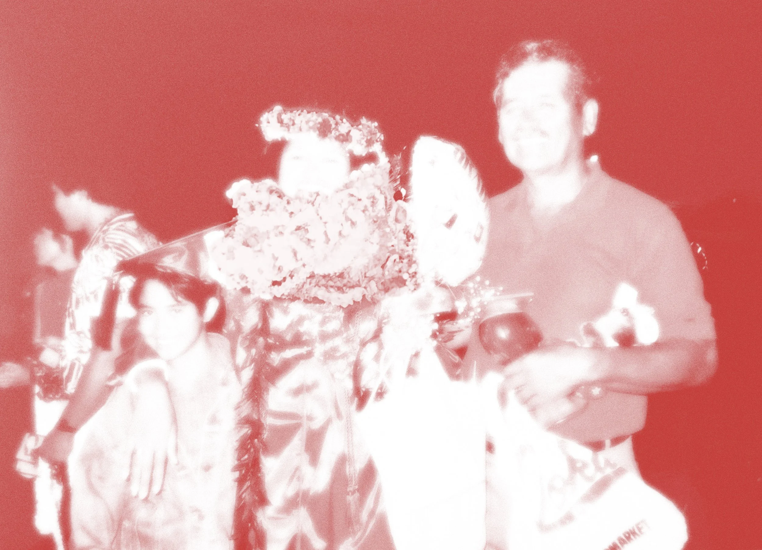
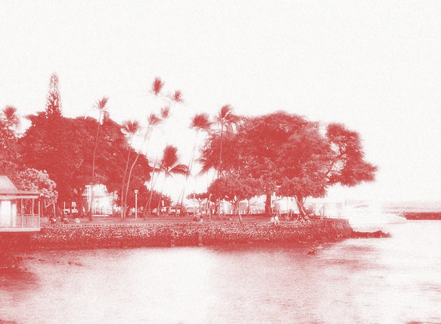
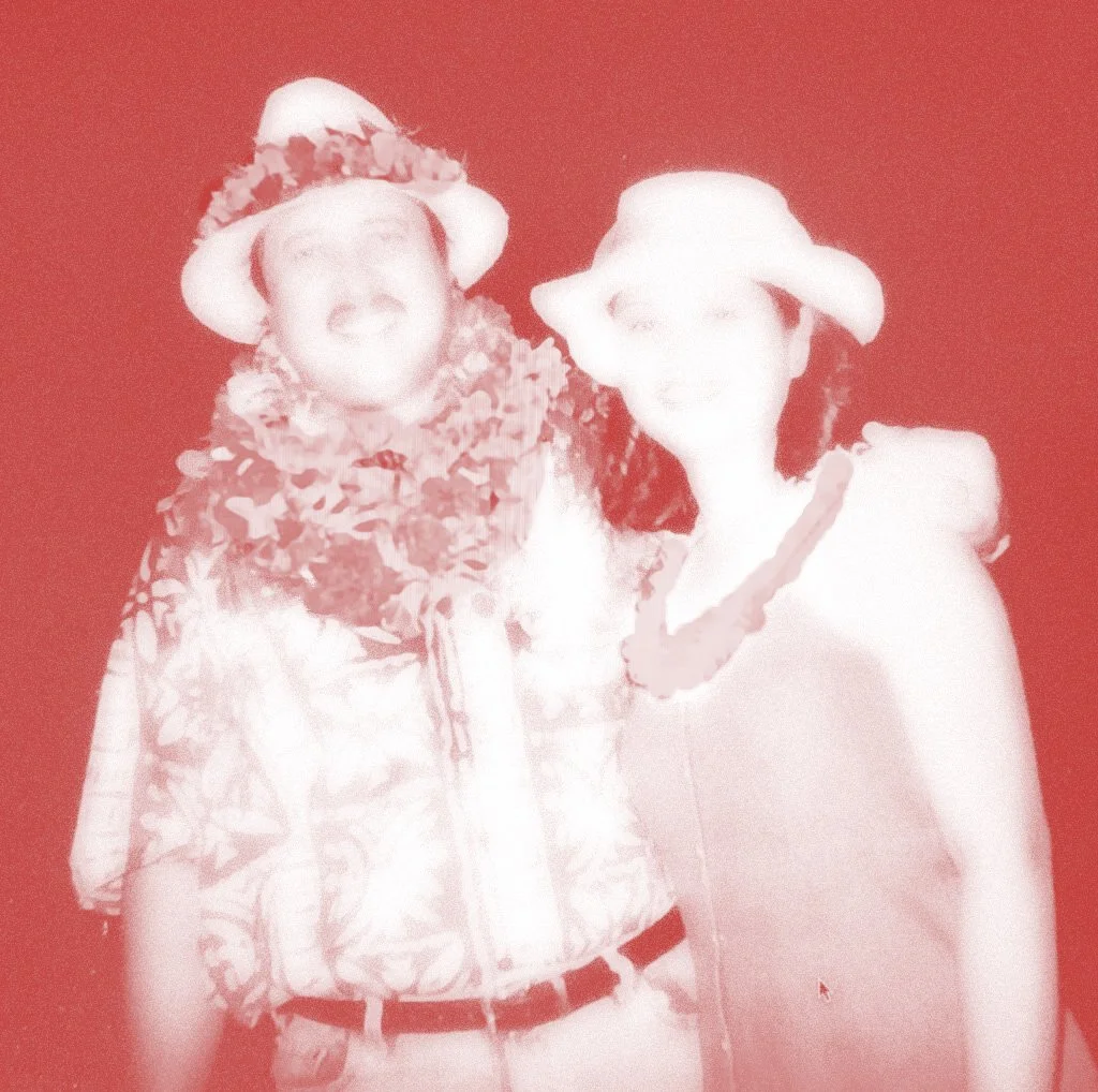
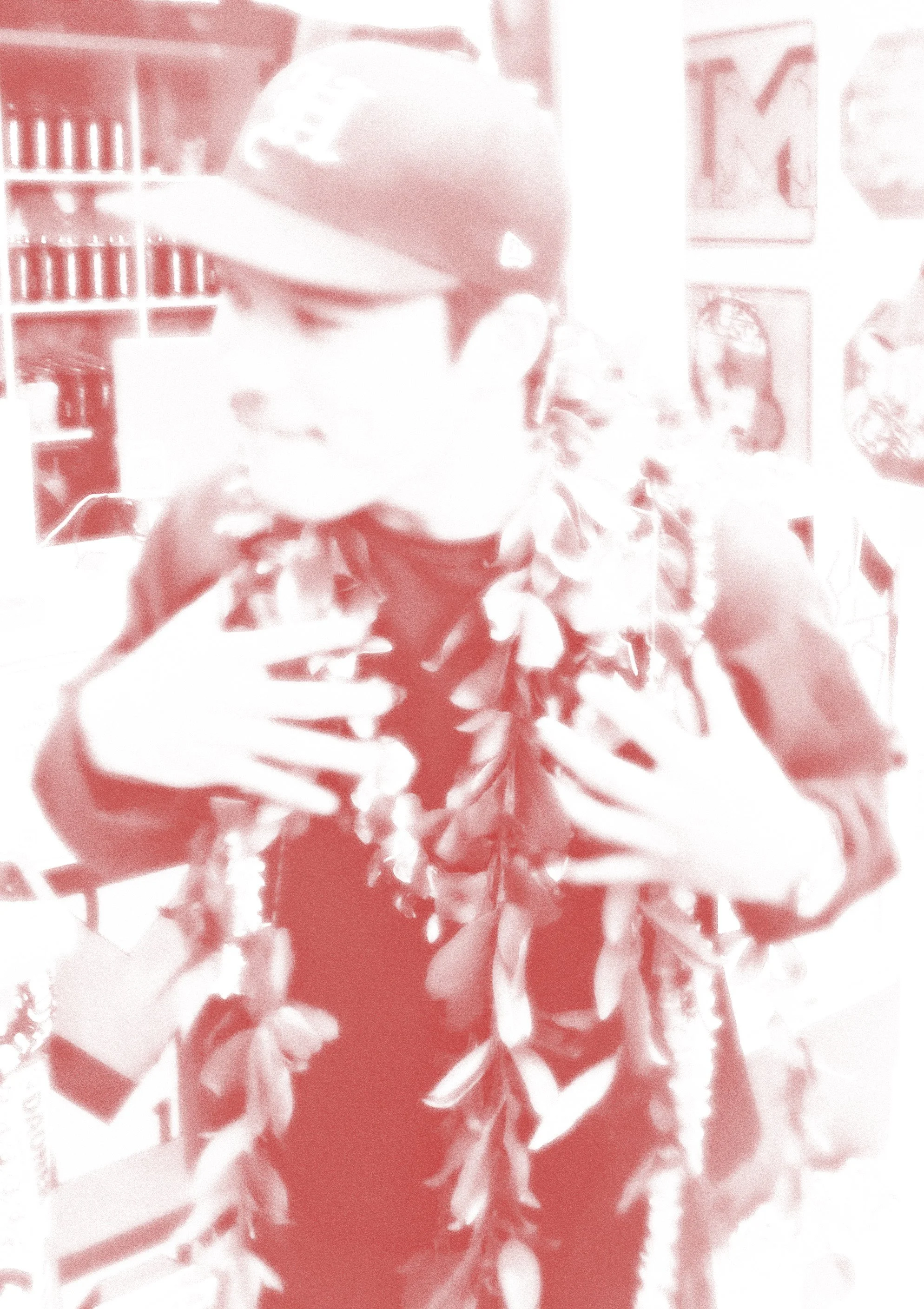
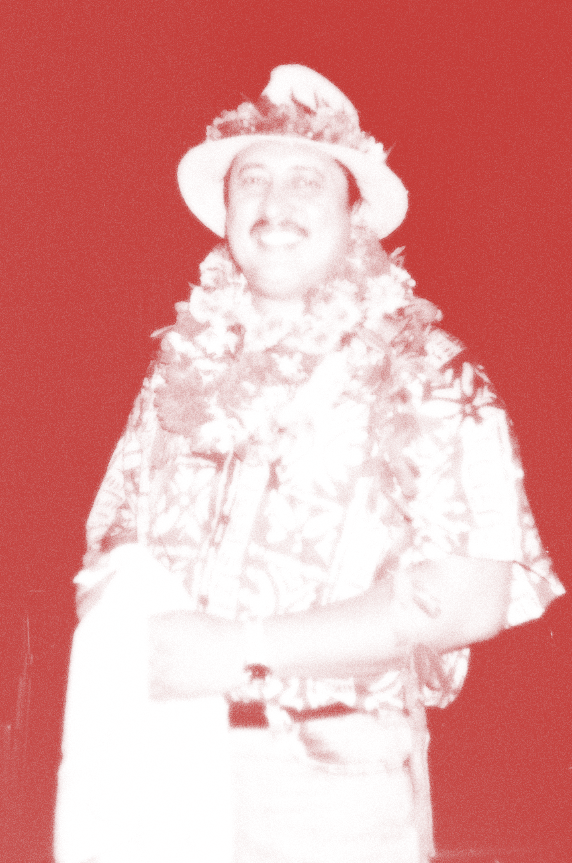
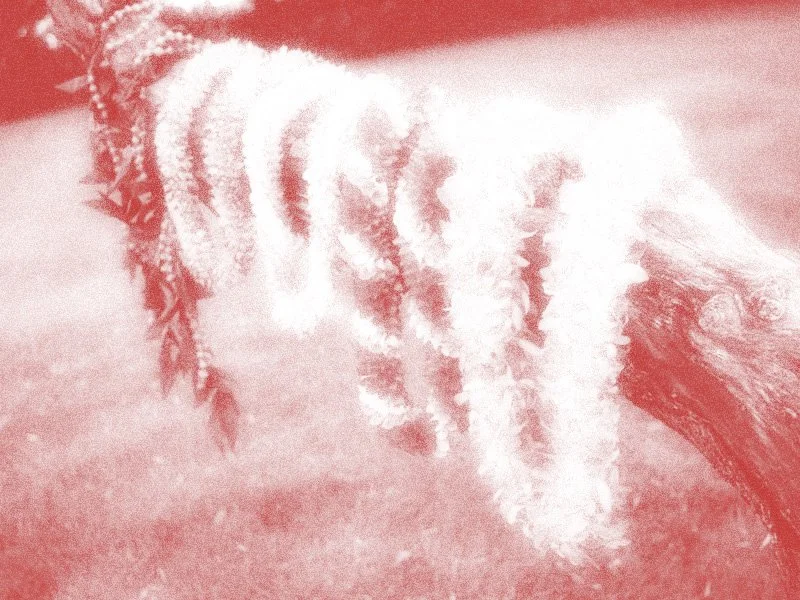
03 Imagery


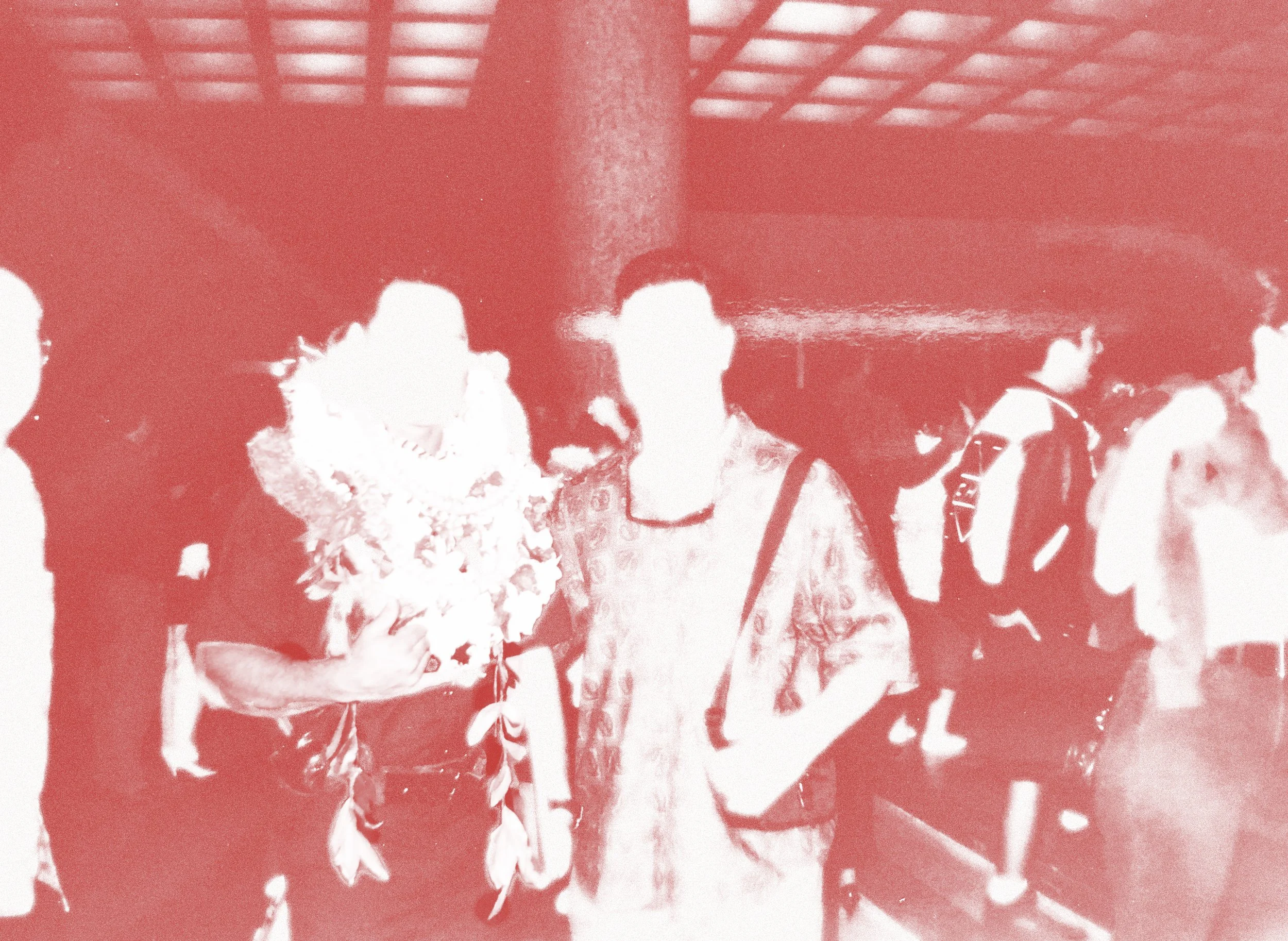
Most of the images used for the event were either photos I took myself or old pictures I found in photo albums. I edited the images in Photoshop to highlight the love and strength symbolized by the red. I also applied a subtle glow effect to create a mature, nostalgic atmosphere.

ONGOING PROJECTThe rebuild in Lahaina remains an ongoing and deeply complex issue, as many local residents continue to fight to keep Hawaiian land in Hawaiian hands amid outside development pressures. You can donate to trusted community-led organizations working directly with displaced families and cultural stewards below:

SEE MORE PROJECTS ✺ ┅ ̗̀➛
SEE MORE PROJECTS ✺ ┅ ̗̀➛
SMALL NOTES, BIG IMPACT - POST-IT
LEI FOR LAHAINA
USF ATHLETICS
SAUL BASS ACCORDION
TYP POSTER SERIES
THREE ICONS